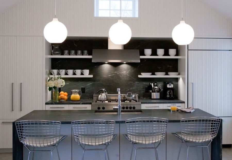
20 Kitchen Cabinet Color Ideas to Transform Your Space
Kitchen color helps define the character of the space. Cabinet color sets the overall tone.
A kitchen palette can influence both the room's feel and its function. It may suit modern minimalism or create a cozy atmosphere.
Current cabinet choices can lean toward soothing neutrals or take a stronger path with bold contrasts. Either direction can balance style and practicality.
Personal taste is a useful starting point when choosing a cabinet color. The color should also work with the countertops. Flooring and natural light matter too, since the cabinet choice complements both.
There are many hues to consider, along with proven design ideas that can guide the color selection.
This collection covers color choices for kitchen cabinets, from soft greens to deep, dramatic shades.
Natural Wood Cabinetry
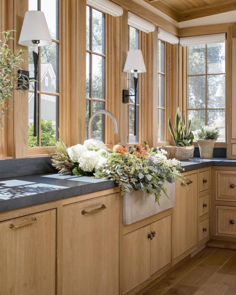
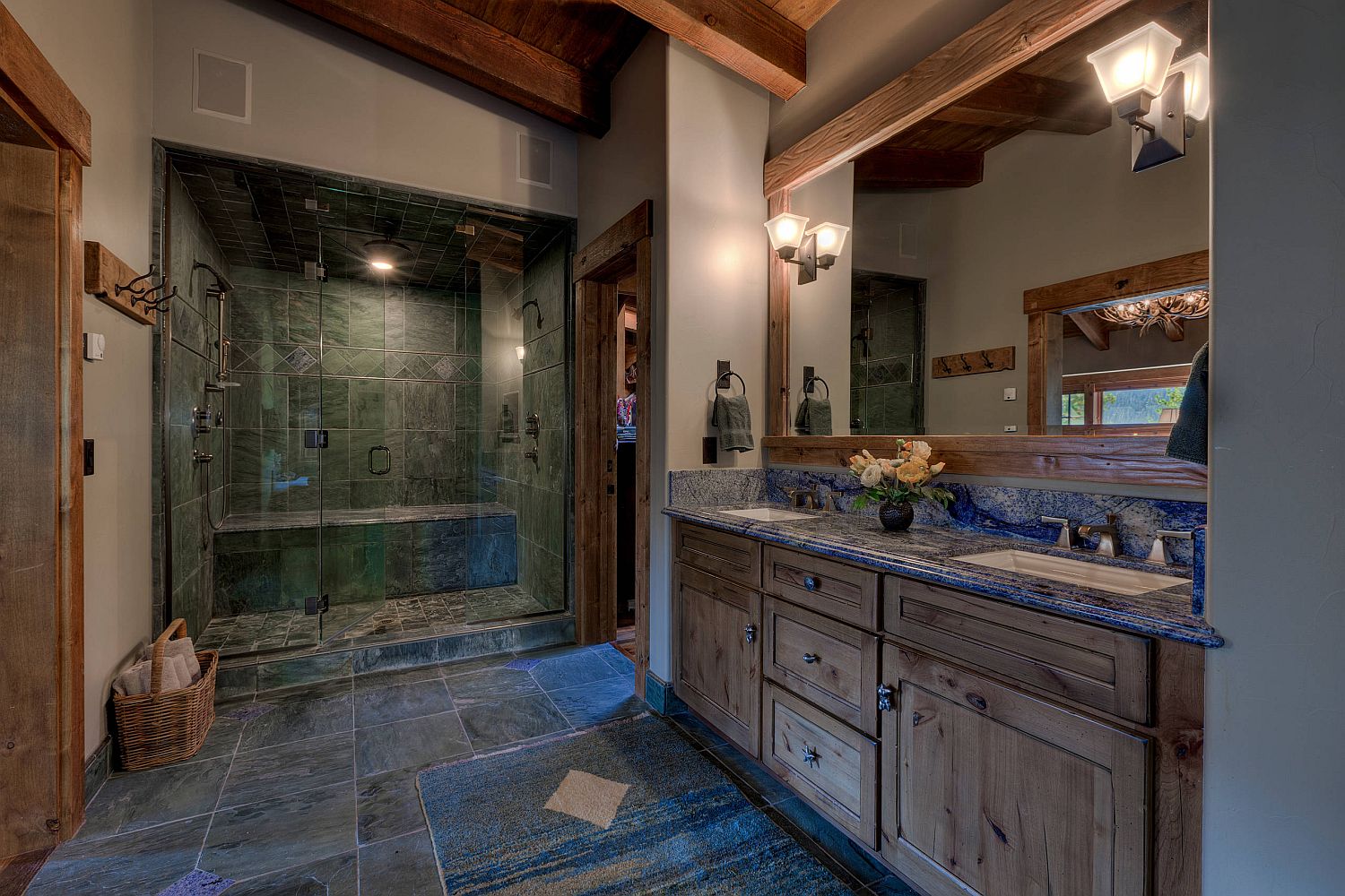
White oak, walnut, and hickory are among the cabinet materials used for natural wood finishes. Natural wood cabinetry provides warmth and texture, while the finish supports authenticity and sustainable design.
Clear stain or a light tint can preserve the wood grain. The grain itself serves as a design element.
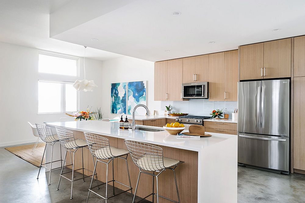
Ceramic backsplashes, metal fixtures, and stone countertops work well beside wood cabinetry. The cabinetry adapts to rustic style through deep-stained oak and to coastal style through light ash tones. Flat-panel wood cabinets contrast with concrete and stainless steel, making them suitable for modern kitchens.
Across the room, properly sealed wood finishes resist wear and age gracefully, supporting longevity and maintenance. Seal wood finishes properly. Wood cabinetry can use matte black or brushed brass hardware, and those hardware choices adjust the overall aesthetic. The cabinetry supports both farmhouse and contemporary styles.
Natural wood finishes support kitchen comfort, functional use, and natural continuity. They also provide a timeless foundation.
Dusty Blue Cabinets
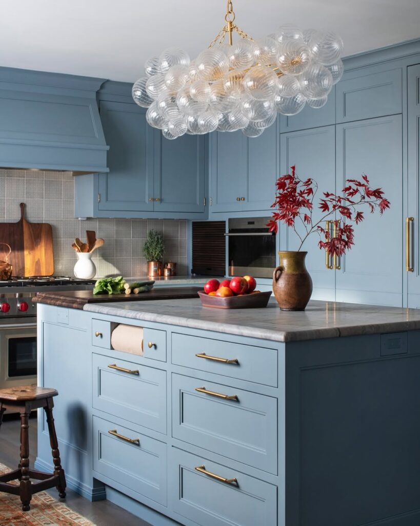
A calm kitchen atmosphere can start with dusty blue cabinets. This muted blue-gray color avoids high vibrancy and keeps the overall effect quiet.
Brushed nickel and pewter hardware pair with dusty blue cabinetry. The color also works with warm wood tones and natural stone, while a chalky finish adds another compatible detail.
Dusty blue supports light flow, suits peaceful kitchens, and works where natural sunlight is limited.
Use dusty blue on all the cabinetry or on the kitchen island.
Modern style can combine dusty blue with slab-front cabinetry and geometric tile. For a rustic style, pair the color with open shelves and vintage accents.
Layered textures support dusty blue cabinetry. Bolder lighting can be used with the color as well.
Dusty blue suits comfort-focused and relaxation-focused kitchens. It also supports long-term color use.
Matte Black Cabinets
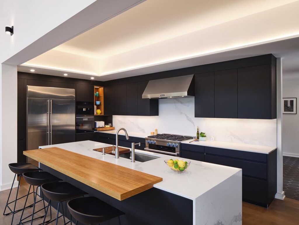
Matte black cabinetry suits minimalist, ultra-modern, and industrial kitchens. Its high contrast makes the cabinet finish a strong presence.
A matte finish reduces glossiness and enhances cabinet texture.
White quartz and pale butcher block countertops pair with black cabinetry. The cabinets also work with brushed gold, chrome, and stainless steel finishes, while black cabinetry defines open-layout zones.
In high-use kitchens, matte black cabinetry frames appliances and fixtures. The matte black finish conceals fingerprints and wear.
Matte black cabinetry suits confident design choices.
Cabinets with a Creamy Off-White Color
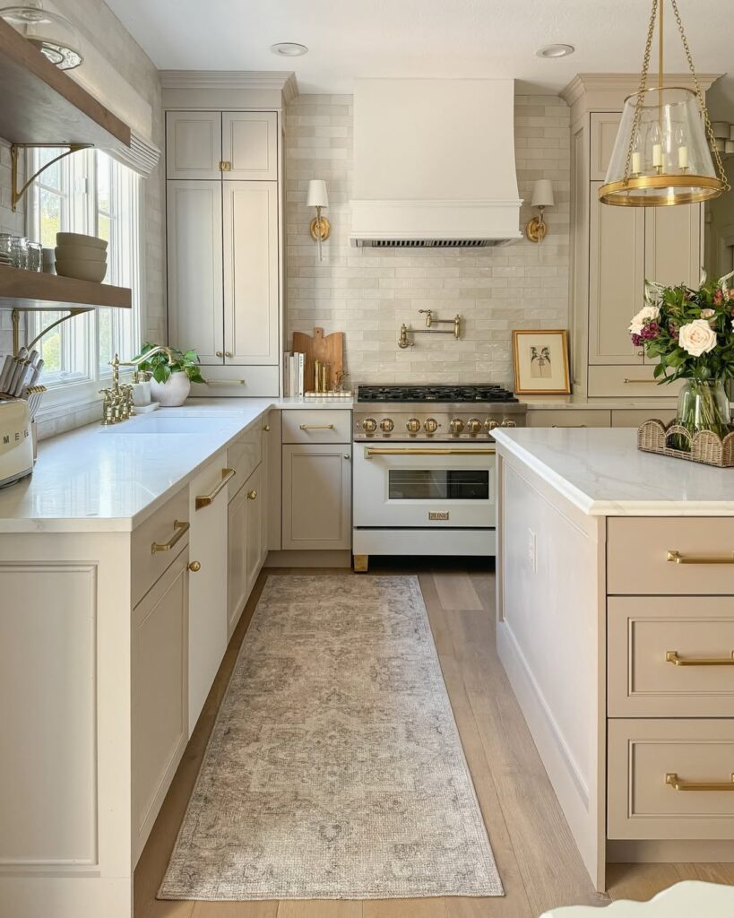
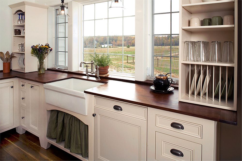
Creamy off-white cabinetry supports warmth and feels softer than stark white. The color also supports versatility.
Creamy off-white cabinetry suits modern rustic, coastal, and French country kitchens. It pairs with woven accents, wood, and natural stone.
Creamy off-white cabinetry allows updates to the backsplash, hardware, and flooring as decor changes. The color adapts to changing decor.
Creamy off-white cabinetry reflects artificial light and natural light. It pairs with matte black and antique bronze finishes, and light-reflective cabinetry may make small kitchens feel more open.
Colorful tile, a bold light fixture, and patterned textiles can all use creamy off-white cabinetry as a backdrop. The cabinets pair with quartz and butcher block countertops.
Creamy off-white cabinetry supports long-term adaptability.
Teal Cabinetry Deep Accents
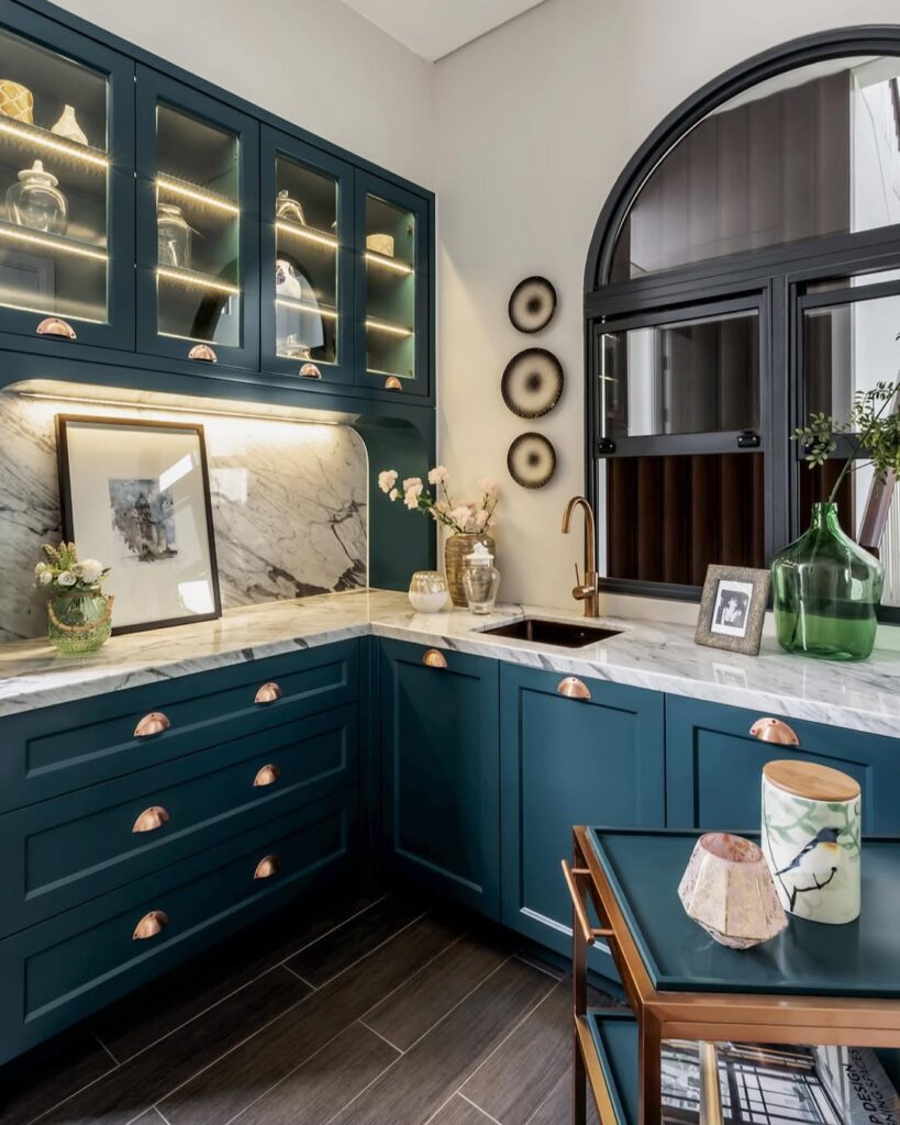
Teal cabinetry has an aquatic quality and a rich, highly saturated color. Teal sits between traditional blue and vibrant green. The cabinetry provides depth.
A matte or brushed teal finish provides dimension without an overpowering effect. The finish keeps the color from becoming too strong.
For placement, teal works well on an island or base cabinets in open layouts and high-ceiling kitchens. It pairs with soft natural wood shelving, aged brass pulls, and neutral countertops. Teal also works with lighter upper cabinets to create a two-tone effect.
Teal suits people seeking color depth without the darkness of black or navy. Lighting highlights its teal undertones, while daylight reveals coastal softness and evening lighting deepens its jewel-like richness.
In traditional or contemporary spaces, teal offers lasting appeal.
Golden Oak Cabinetry Revival
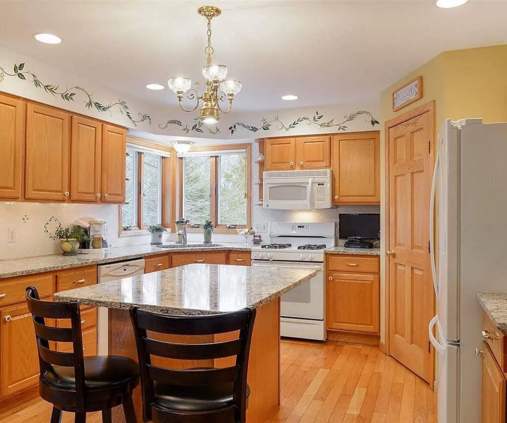
Golden oak cabinetry is closely associated with kitchens from the 1980s and 1990s. The finish is experiencing a modern revival, with its natural golden oak color still clearly visible.
Golden oak brings a timeless quality to the space and pairs with contemporary fixtures as well as updated finishes. Its varied wood grain gives the feature more depth and authenticity, qualities that are harder to reproduce on painted surfaces.
White quartz countertops, concrete-look tiles, and matte black hardware all pair with golden oak cabinetry.
The golden hue is less stark than white and adds warmth to interiors. Golden oak fits transitional kitchens, Scandinavian-inspired spaces, and open-concept spaces, where natural materials are emphasized.
A central island can feature golden oak cabinetry, or the finish can cover full cabinetry runs. It shows fewer visible scratches and smudges, which supports low maintenance and durability. Golden oak cabinetry also works with both modern and nostalgic styles.
Golden oak provides familiarity while aligning with current design preferences. The finish is also characterized as a practical choice.
Sage Green Cabinets
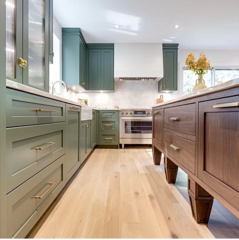
The gentle, natural shade of sage green works with both light and dark palettes. Sage green brings that flexibility to kitchen cabinets.
Sage green cabinetry pairs with natural wood, matte black hardware, and white quartz. Subway tile completes the backsplash.
Sage green complements Scandinavian, farmhouse, boho, and transitional styles. The cabinetry can have either a matte finish or a muted gloss.
Brushed brass fixtures and open shelving pair well with sage green. Lighter shades also help open up small kitchens.
Sage green avoids the look of sterile whites and bold pigments. Designers recommend it for kitchens with abundant natural light, and it adapts to warm LED fixtures.
Gentle green brings a sense of tranquility to the kitchen. It is associated with a calm style.
Warm Terracotta Cabinets
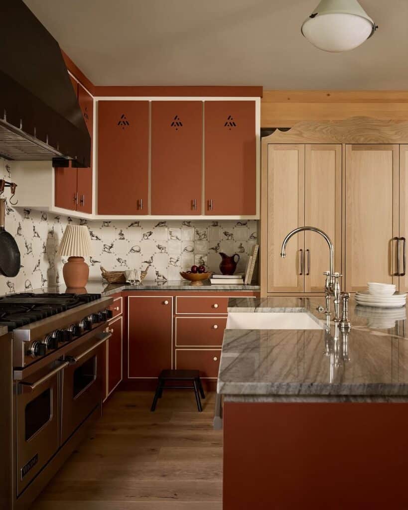
Terracotta is a burnt orange-brown color based on earth tones. It provides warmth and rustic character to the cabinets.
Natural clay gives terracotta its earthy basis. The color pairs with rattan accents, wood finishes, and brushed bronze details.
Terracotta suits Spanish-style, Mediterranean, and eclectic kitchens. It pairs with walls in off-white or cream.
Terracotta works with tiled floors, exposed beams, and farmhouse elements.
Terracotta cabinets with a matte or satin finish have low light reflection. These finishes preserve the appearance of clay, while the color also supports modern layouts.
A terracotta pantry unit can anchor the color, which can also cover full cabinetry or an island. Terracotta contrasts with cool tones such as concrete, stainless steel, and slate.
In a kitchen, this tone connects color with comfort and remains rooted in tradition. It can also be executed in a modern way.
Bold Mustard Cabinetry
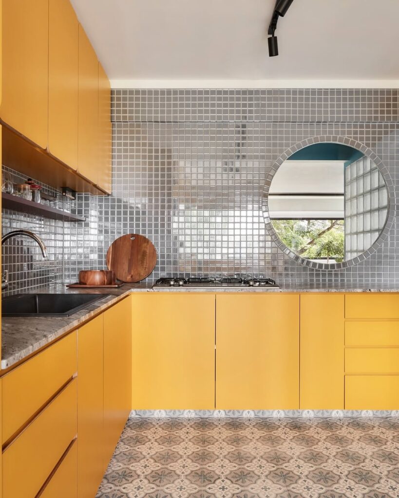
In neutral kitchens, mustard cabinetry can serve as either the main feature or an accent. The cabinetry uses a saturated mustard yellow in a matte or satin finish.
Mustard cabinetry pairs with geometric tile, vintage decor, and open shelving. It suits boho-inspired spaces and mid-century modern layouts. Matte black hardware, white marble, and natural wood complement the color. For placement, mustard works best on lower cabinetry or central islands, although it can also suit smaller kitchens.
Mustard pairs with cool slate gray, deep blue, and olive green accents. Designers use it when personality is desired and when nontraditional color preferences are part of the plan. The shade is less bright and less polarizing than overly bright or polarizing colors.
Across the room, mustard can support the kitchen focal role as a confident choice.
Charcoal Gray Cabinets
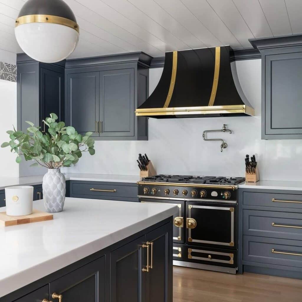
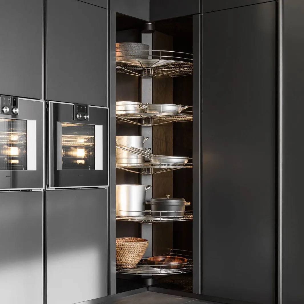
For contemporary kitchens, deep charcoal gray offers a softer alternative to black. Its depth suits the clean lines of a contemporary setting.
Brushed steel hardware pairs with charcoal gray, as do marble counters and oak floors.
Charcoal cabinets suit both rustic industrial and ultra-modern styles. A matte surface or soft-sheen finish keeps glare low.
In an open-concept kitchen, charcoal cabinets define the cooking area. Stainless steel appliances and metallic fixtures frame the space.
Lighter upper cabinets pair with charcoal, as do stone backsplashes and butcher block counters. Integrated LED lighting works with the color, while darker grays can mask wear.
The neutral character of charcoal supports changes in the decor. Charcoal also works when the decor changes.
Two-Tone Cabinetry
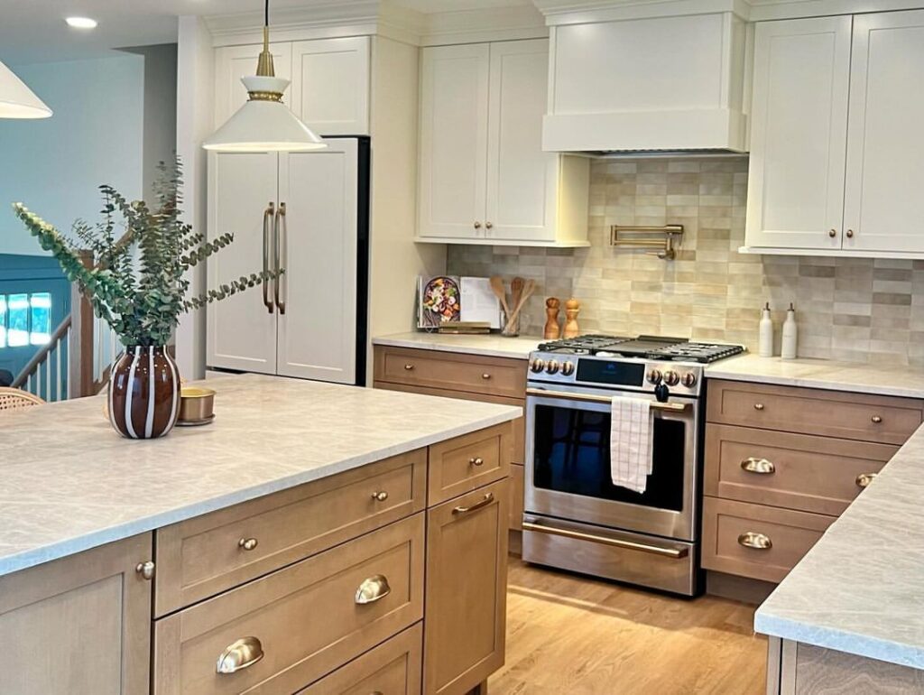
Neutral wall cabinetry sits behind a bold kitchen island. The lighter upper cabinets are paired with darker lower cabinets, while the island stands against the neutral wall cabinets.
Lighter upper cabinets and darker lower cabinets let you use two colors without committing the entire kitchen to one strong shade. The two-tone arrangement also reduces monotony in the cabinet layout.
Greige and white create a subtle cabinet contrast. For a bolder pairing, navy cabinets can sit with walnut cabinets.
In a small kitchen, keep the upper cabinets lighter to support an open feeling. Darker colors work best at the base, and a dark base with light uppers may make the kitchen look larger.
Charcoal cabinets pair with warm woodgrain for a grounded look. Sage and soft taupe create a gentler combination, while forest green next to ivory offers stronger contrast.
Two-tone cabinets can use brass hardware with matte black hardware as another finish option. Balance the tones, finishes, and materials so the design does not become visually overloaded. Using uniform hardware metals helps unify the cabinet colors.
Single-color schemes are an alternative to two-tone cabinets. Two-tone cabinets can also support a flexible kitchen design.
Deep Navy Cabinets
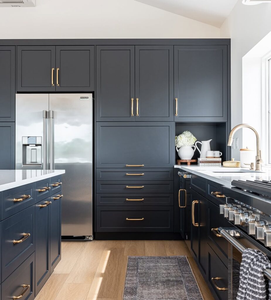
High-depth navy has a dark tone, but it retains more warmth than black or charcoal.
White marble countertops create a contrast with deep navy. Gold or brass hardware pairs with the color, which also has timeless appeal.
Deep navy provides visual weight, so it works well on lower cabinets and island bases. Upper spaces can still remain light and airy.
In modern and traditional settings, navy adapts to both flat-panel and Shaker cabinet styles.
Deep navy suits a kitchen with ample natural light. It pairs with a soft wood finish, a glass-front upper cabinet, and open shelving.
Navy cabinets can conceal surface marks such as smudges and fingerprints. Compared with lighter colors, navy hides these marks better and has long-term relevance.
A Lilac Kitchen
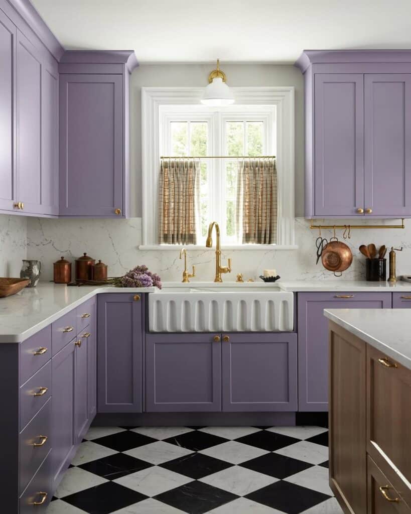
In kitchen design, lilac offers a soft pastel-gray tone. This color is less feminine than overly feminine colors, giving the kitchen color a quieter quality.
Classic white walls contrast with lilac, while deeper lower tones balance the color above. Lilac works on upper cabinets and keeps the arrangement layered.
Brushed gold, matte silver, and oil-rubbed bronze hardware all pair with lilac. The color also suits modern spaces and vintage-inspired rooms, especially alongside terrazzo countertops, light wood flooring, and creamy ceramic tiles.
Across the room, lilac can show daytime tone shifts as it responds to natural light. These changes in tone occur throughout the day.
Lilac combines color with neutrality and avoids overly trendy styling. Designers have increasingly embraced it.
Lilac supports livable kitchens when it is used as a cabinet color. It helps create a balanced, relaxed atmosphere in warm kitchens.
Soft Blush Cabinet Accent
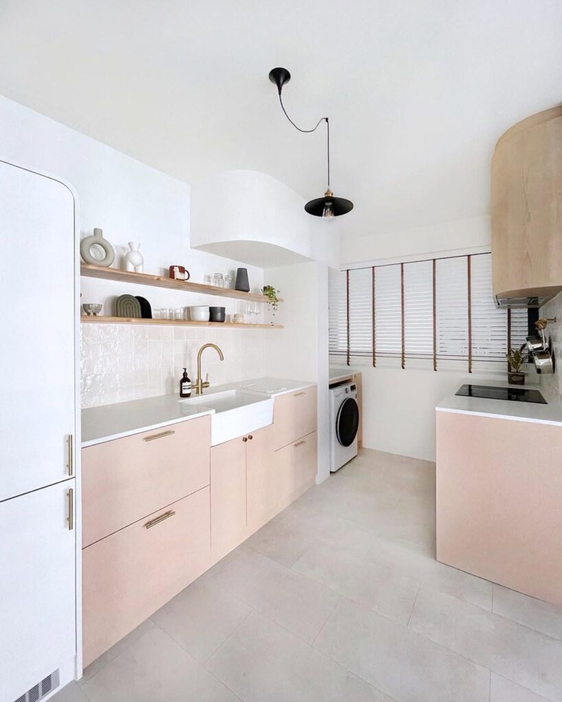
Blush cabinetry uses a muted pink tone that adds warmth without making the color scheme loud. Blush suits subtle color schemes.
Neutral countertops pair with blush cabinetry, as do gold and champagne hardware. Blush cabinetry suits contemporary interiors, Parisian interiors, and romantic farmhouse interiors.
Blush contrasts with traditional gray and traditional white. Use it on the kitchen island or the lower cabinets for a low-commitment color choice.
The main design pairs natural oak and cream with a brushed metal finish. Each nearby detail adds a different tone or texture.
A patterned backsplash can sit with blush cabinetry, which also pairs with terrazzo flooring and herringbone tile. Use blush in a kitchen with high natural light, since natural light highlights the blush pigment.
Blush cabinetry supports everyday usability.
Forest Green Cabinets
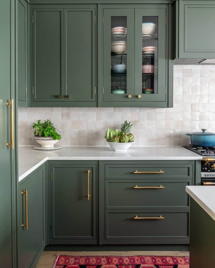
In a kitchen, earthy forest green cabinetry provides depth without relying on dark neutrals. The color brings a green tone to the cabinets.
Forest green cabinetry pairs with marble, wood accents, and brass fixtures. The marble surface is one nearby detail.
Forest green cabinetry suits traditional and transitional kitchens. Its saturated green pigment also supports a heritage-inspired style.
Warm walnut and warm oak flooring complement the forest green cabinetry. Use the green on lower cabinets or a statement island, then choose white or light stone countertops to help prevent a closed-in feeling.
Lighter tones conceal wear better than a forest green finish, although the forest green finish also conceals wear. Forest green suits open-plan layouts and large layouts.
Glass-front upper cabinets pair with forest green. The forest green color can be used throughout the cabinetry.
Forest green cabinetry suits both city lofts and rustic countryside kitchens.