10 Stunning Living Room Color Combination Ideas
Color combinations express personality and help define the mood of a room. They also support cohesive, inviting living rooms.
A color scheme shapes how a room feels and how its space is perceived. It can also show the room’s style while changing the overall ambiance. The right choices may make a room feel cozy, vibrant, or serene.
Choosing among many color combinations may feel overwhelming.
This guide uses color ideas to simplify the process.
Color combinations help living rooms work well for everyday life while keeping them visually appealing. Some rooms benefit from bold contrasts, while others are better suited to soft harmonies.
Sage Green Beige and Warm Wood Palette

Creamy textiles pair with sage. An open living area suits the muted green backdrop, while soft beige upholstery and warm oak shelving provide other pairings. Together, these choices support continuity between zones.
Layered linen curtains reinforce the organic feel of the space. Subtle veining in the stone adds to that feeling, as do the matte ceramics.
A room with this palette can look brighter, and the palette supports biophilic design. It also works with Scandinavian, modern farmhouse, and transitional interiors without much visual fatigue.
Chestnut Leather in Olive and Plum
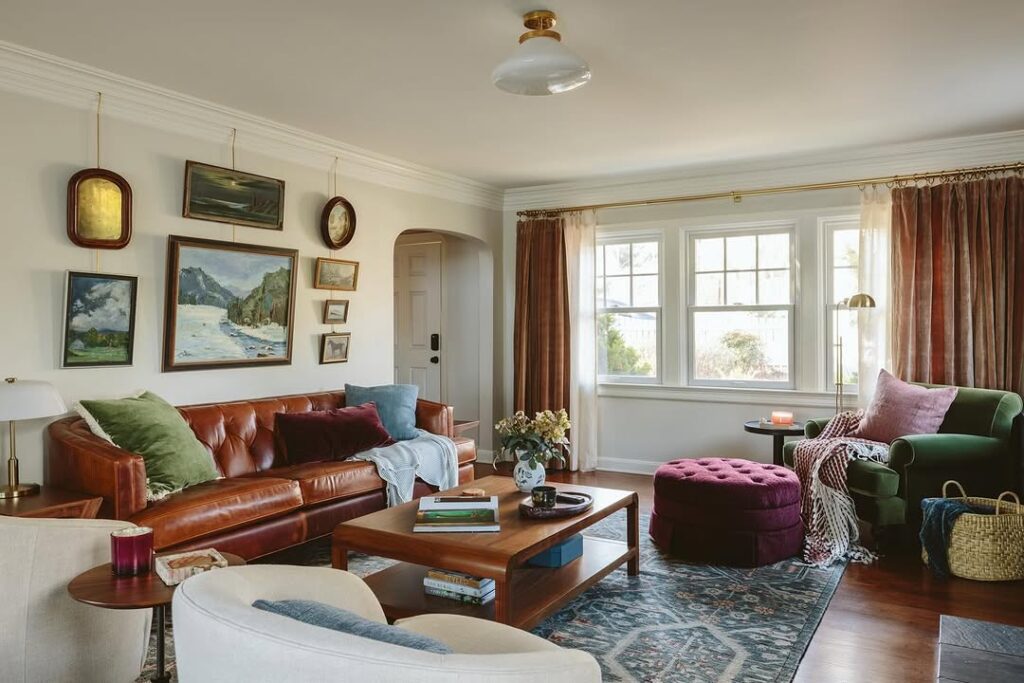
Chestnut leather seating anchors the room. Velvet cushions in olive and plum introduce both colors, while a patterned throw and artwork repeat the olive and plum combination.
The chestnut, olive, and plum combination preserves softness, supports refined masculinity, and suits classic-modern and moody transitional spaces. Dark-stained wood, aged brass, and a textured rug extend the palette's richness.
Sheer curtains modulate daylight contrast. Warm ambient lighting performs best with the chestnut-olive-plum combination, revealing layered hue complexity and preventing darkness from flattening the hues.
Soft Mint and Creamy Gold
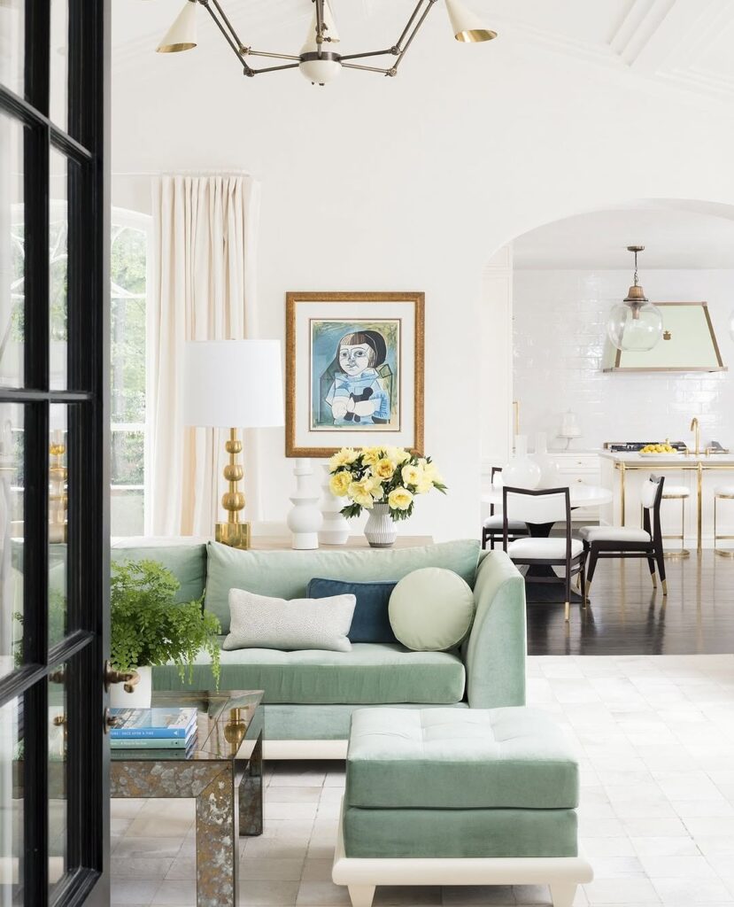
Soft mint walls set the color around the room. Creamy gold appears in the metallic finish, hardware, lighting, and trim, and the metallic detail adds warmth.
Ivory seating supports brightness in the room. Pale oak floors do the same, while sheer curtains let brightness remain part of the space. This color combination suits contemporary, coastal, and minimalist interiors.
The color combination reflects natural light and makes the space feel more open. It also supports seasonal updates.
Wine Plum and Cream Palette
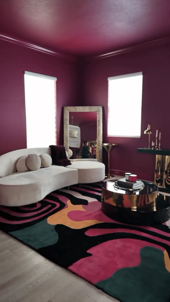
Wine plum walls and statement wine plum seating establish depth. Cream upholstery, silk drapes, and a pale marble table balance the wine plum color.
A gold-framed mirror, crystal lighting, and satin texture support the glam style. Glam elements should avoid excess.
In boutique-style apartments, evening entertaining spaces, and formal living rooms, the wine plum-cream combination suits the setting.
The wine plum-cream combination is compatible with modern glam décor. It also works with classic transitional décor, creates visual drama, and supports layered lighting.
Charcoal and Linen Palette

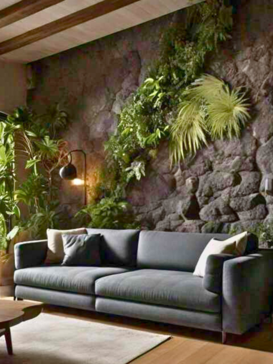
A dark backdrop is balanced by a breathable texture and a pale finish. The neutral linen sofa adds to that balance.
A charcoal wall is paired with a linen sofa, ivory drapery, and a light oak table. Layered lighting, a matte ceramic piece, and a bouclé pillow soften the contrast. The linen sofa also helps prevent visual heaviness.
The charcoal-neutral scheme avoids brightness overload while providing warmth. It suits both contemporary and minimalist interiors.
Neutral flooring supports the charcoal-neutral scheme, as does subtle metal. Charcoal walls control glare and emphasize architectural edges, while the palette supports seasonal accent swaps.
Retro Burnt Orange and Mint
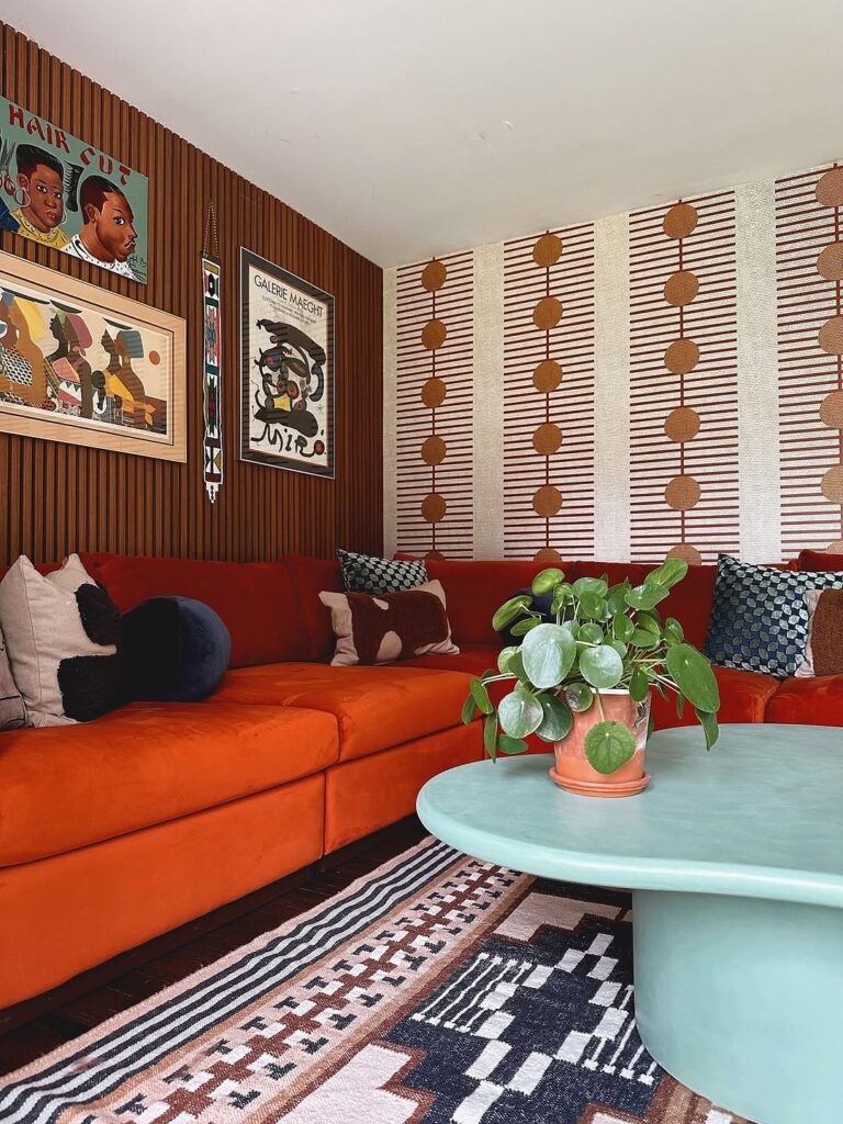
Controlled contrast supports energetic interiors without creating visual chaos. The color pairing keeps the room lively but organized.
A burnt orange sofa is paired with a white ceiling, walnut furniture, and a terrazzo surface. The burnt orange accent wall holds mint art, while a mint lamp adds another small color note.
This color pairing works well in retro living rooms and mid-century modern rooms. The color gives the room personality.
Daylight reflection helps the pairing work in compact urban spaces. It also supports bold styling while reducing visual fatigue.
Mustard Yellow and Bubblegum Pink

Strategic combinations create a controlled statement with this retro-inspired palette. Mustard yellow and bubblegum pink bring the statement together.
A mustard wall sets the base, while bubblegum pink accents highlight curves and mid-century shapes. A white ceiling, walnut furniture, and a neutral rug prevent excessive intensity.
Vintage lighting and patterned cushions, along with chrome details, can accompany the classic retro design drawn from e31. The e24 performs well in bright rooms, where natural light enhances it, and it suits creative households.
Midnight Blue and Royal Purple

Midnight blue walls and royal purple accents combine for dramatic impact. These moody hues require intentional handling, but the palette can still maintain harmony.
Dark walnut flooring supports the palette, as does a smoked-glass table. Silver-toned metal adds another supporting material. The deep blue wall is paired with a royal purple art piece and a royal purple cushion.
Architectural features and intimate lighting zones give this palette places to work, while the dark surfaces add contrast, depth, and nighttime richness. It performs well in larger living rooms and suits statement-driven schemes.
Built-In Shelves and Sofa in Mint and Blush Pink

A blush pink sofa acts as the focal anchor and contrasts with the cool-toned built-in. The arrangement uses that contrast for a playful effect.
White oak floors set a neutral base beneath the mint shelving. Neutral rugs, soft brass hardware, and the white oak floors stabilize the palette, while the mint shelving balances the warmth of the pink.
This combination maintains a light room and suits compact apartments as well as creative family spaces. It also limits visual clutter.
Nighttime ambiance works well for daily living and social gatherings. Layered lighting supports that atmosphere while preventing color washout.
Charcoal Velvet Blush Ceiling and Pastel Art
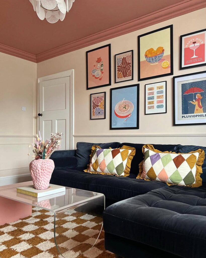
Overhead, a blush ceiling keeps pastel tones from creating a heavy atmosphere. Charcoal velvet upholstery establishes a sense of luxury.
Muted peach, lilac, and cream art helps bridge the color contrast between the light-reflecting blush ceiling and the light-absorbing charcoal velvet seating.
Curved furniture and a mirrored accent support the scheme, with a low-gloss finish adding texture. The controlled color layering supports the mood of a boutique living room for both daytime and evening use.
Honeywood Cottage Florals and Pastel Checks

Natural timber provides the main setting for pastel textiles with floral and checkered patterns. The timber supports the patterned textiles and the cottage palette.
Soft cream drapery coordinates with honeywood tones. Floral upholstery and pastel checkered pillows coordinate with those tones as well.
In a small space, muted green accents, woven baskets, and subtle brass add layered warmth. The palette suits small spaces, and each of these details supports that layered warmth.
In this setting, the combination maintains a current feel while working with vintage and modern farmhouse decor styles. It also suits a nostalgic, calm mood.
Olive Charcoal and Burnt Orange Palette
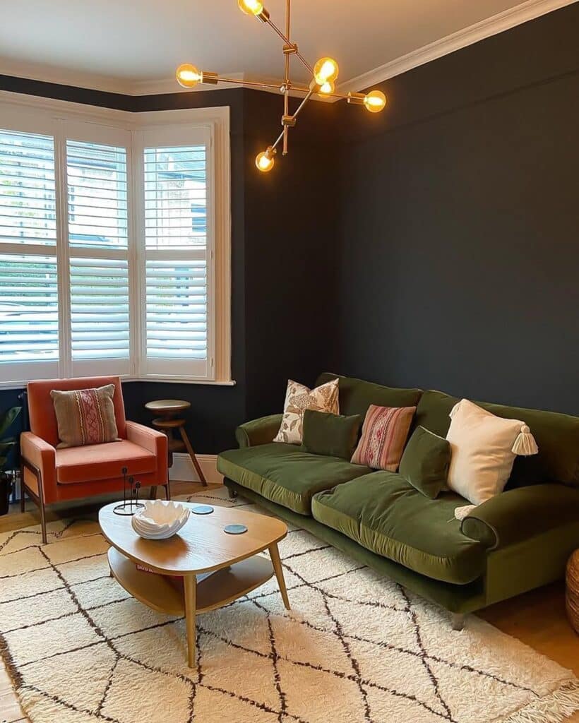
Across the room, burnt orange art, a burnt orange accent chair, and a burnt orange pillow add controlled energy. Olive walls provide softness, while charcoal architectural features anchor the room.
Smoked wood finishes enhance the contrast in the room. Textured stone and blackened metal lighting do the same, while keeping the materials from overpowering the scheme.
Focal-zone definition is one benefit of this palette. Larger rooms benefit from it too, especially when layered shadows add depth. The combination suits contemporary, industrial, and desert-modern interiors.
Greige and Soft Blue

Soft blue provides subtle color interest. Balanced undertones make implementation easy, while greige gives the palette a dependable foundation.
Pale wood furniture supports a warm-cool equilibrium in the room. A textured throw and greige sofa support that same balance.
Soft blue ceramic and artwork introduce gentle contrast alongside a soft blue pillow. The soft blue accents preserve a calm feeling.
Brightness and comfort both matter in this room. A transitional, Scandinavian, or coastal-inspired style suits it well.
The greige and soft blue palette offers low-maintenance harmony and long-term flexibility. It adapts to seasonal decor and works across varying lighting conditions.
Mustard and Blush Industrial Palette

A mustard wall contrasts with a blush textile, which softens the exposed brick and blackened steel. A warm wood shelf, filament lighting, and concrete accents complement the industrial palette. The mustard-blush combination balances softness with structure.
The mustard-blush industrial palette suits converted apartments and loft-style living rooms. Raw textures stand out, visual warmth increases, and the setting stays inviting from morning through evening. Layered rugs add comfort softness.
Teal Burnt Orange and Moss Green Accented Walls

The high-saturation teal wall is supported by a burnt orange cushion, a moss green accent, and textured neutrals. These warm secondary tones provide balance without creating visual noise.
A walnut table anchors the space, while brass lighting and a woven rug keep the materials from feeling flat. The walnut table and woven rug also add variation to the finish.
Light flooring works well with the palette, while dark flooring creates another pairing. The palette supports seasonal styling changes and suits mid-century, eclectic, and modern boho interiors. It is also useful when creating photographs for social sharing.
Deep Merlot and Bouclé Palette

A deep merlot wall is balanced by a cream rug, warm brass lighting, and light-reflective tactile fabric. The cream bouclé sofa and deep merlot seating keep the wine-toned palette grounded.
A pale stone table and muted artwork help prevent saturation overload. The deep merlot palette supports a cozy evening ambiance while remaining suitable during daylight hours.
Layered window treatments regulate light and maintain indoor color accuracy. The deep merlot palette suits formal living rooms and provides visual weight while preserving comfort, softness, and everyday livability.
Terracotta Beige and Natural Fiber
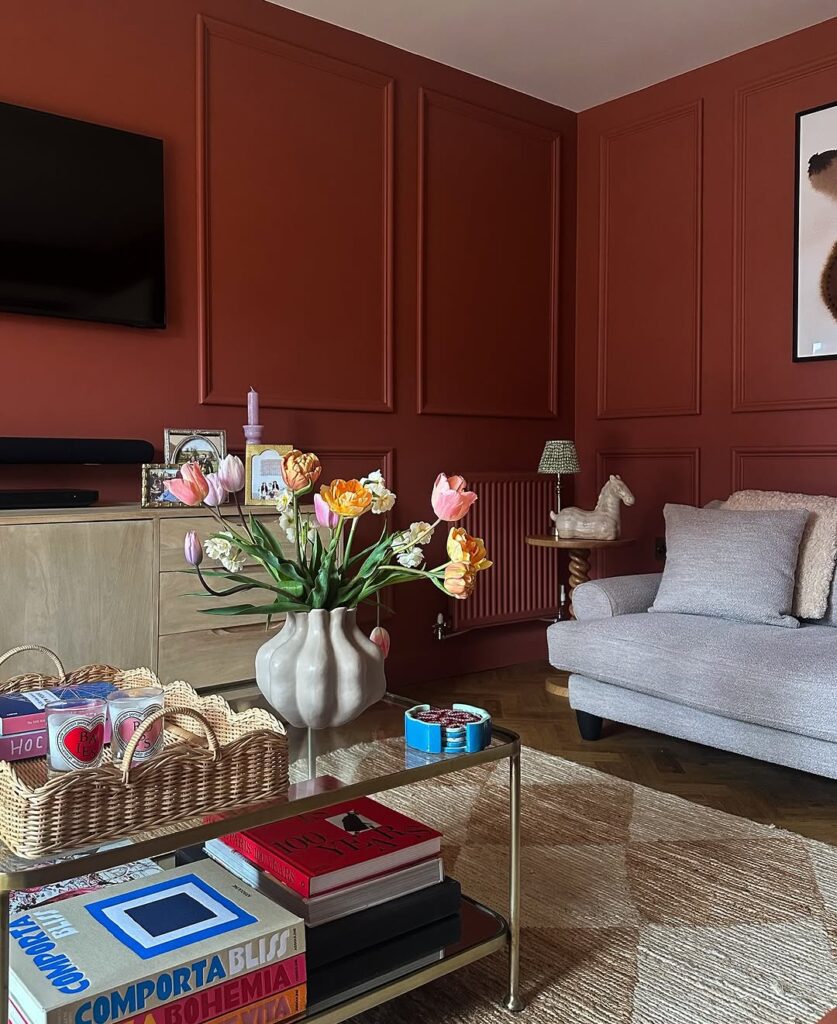
A beige sofa anchors this palette. Terracotta wall panels add visual depth and pair with oatmeal textiles and a natural-fiber rug.
Warm wood gives the console a grounded finish, while a ceramic vessel and matte-black fixture add contrasting details. Together, the console, vessel, and fixture support the terracotta palette.
The terracotta palette suits Mediterranean-inspired and desert-modern interiors. Strategic color variation is essential for keeping that approach controlled.
Bright daylight supports the terracotta palette, which avoids overly bold and saturated colors. The result helps create a stable, comfortable environment.
Soft Sage and Peach Palette
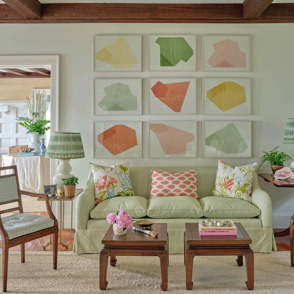
Gentle green surfaces support expressive highlights. The green can appear across the room without losing its soft quality.
A soft sage wall is paired with pale wood flooring, a terrazzo table, and peach artwork.
White linen curtains and white upholstery keep the space bright without washing out the colors. The soft sage-peach combination fits biophilic, Scandinavian, and modern organic interiors, while supporting tranquility.
A matte finish reinforces the soft sage-peach palette and helps reduce visual stress, support daylight diffusion, and provide subtle warmth without overpowering a compact area. A botanical accessory reinforces the palette too.